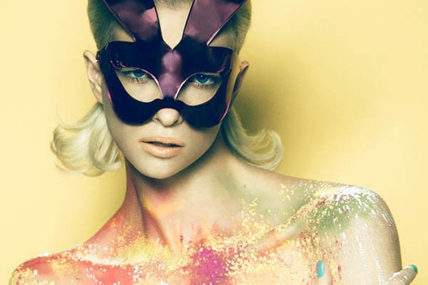
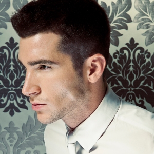
Yossi Michaeli has long been one of my favorite editorial photographers, and after spending about 5 seconds on his website (link below), it won’t be hard for you to see why. I forget exactly how I was introduced to his work, but it was sometime in 2010, and I was so enthralled and inspired that I felt compelled to reached out to him via Facebook and let him know. When he responded it made my entire week, and he even wished me a happy birthday a year later! (You can’t imagine how much I fangirled…and you probably don’t want to know.) Since I’ve been following his work, one of the distinctive, defining features over the years has been his brilliant use of color and tone. When I first discovered his work there was a definite theme of elegantly muted colors and desaturated skintones. Recently he seems to be embracing a more saturated palette with a ubiquitous use of primary colors. Throughout all of his work he seems to favor denser shadows and really bold contrast, though there is some flexibility to that depending on the project. Here is a small sample of his work to whet your appetite.
Yossi’s work embodies a style of editorial photography that I absolutely love: sensuous color palettes , clean design, impeccable technicality without being forced or starched, engaging subject matter, expert lighting and a really fabulous sense of style.
Yossi hails from Tel Aviv, Israel and currently lives in New York.
Visit Yossi’s Online Portfolio for more fabulous style and color!
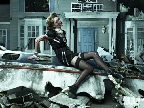
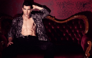
Thank goodness for America’s Next Top Model!! If I hadn’t decided to give that show one (final) chance during its 714th cycle, I probably would’ve never heard of photographer Ricky Middlesworth, which really would have been a shame, since upon viewing his work he has instantly become one of my favorite commercial/editorial photographers to date. A self-described production artist, his work captivated me with his masterful use of environments, light, and body language. Something else to note: his images are always driven by the subject, and some aspect of their story.
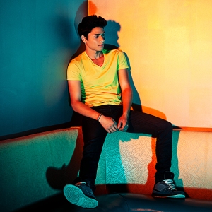
From ANTM Cycle 19
During his first gig on America’s Next Top Model All-Stars, Ricky’s work was described as being all about “timeless glamor,” and while I agree that his work always has some element of glamor, I wouldn’t necessarily agree that the gist of his photographic identity is built on being “timeless”. On the contrary, very often there’s a youthful, modern, at times futuristic sensibility that drives his work that I just find sooo juicy! Speaking of juicy…
This Arizona native is a guy who knows how to make a bold statement in a single image, which I’m sure is why he’s such a success in the commercial world where that quality is gold.
The photographer himself!
Visit Ricky’s Online Portfolio for more sleek, powerful imagery!
I got bit by that notorious lovebug this Valentine’s Day, and to my dismay, a topical ointment has not yet been developed for it, so I just had to do a photoshoot to get rid of the itch. I teamed up once again with the always wonderful MUA Raushanah Washington to create some really romantic beauty looks. Our visage au choix was that of the beautiful Emily D. What you couldn’t see in these shots is that Frankenstein, Raushanah’s adorable bichon frise, was pretty much on top of me the entire time. All creative direction credit goes to him.
For these looks I knew the setup had to be tight and concise since space was limited; we shot in a living room with average height ceilings. Also because I didn’t have any grids handy (my personal go-to modifiers for beauty), I knew that I had a bit more of a challenge on my hands since Emily’s porcelain skin was highly reflective, and with the lights so close it was important to not lose detail. The fact that all three looks turned out to be lit using low-level lighting techniques was a coincidence, but lets pretend that I’m just awesome that way and meant for it to happen. Ok? Ok.
CLASSIC:This look, inspired by classic Hollywood lighting, was achieved using a 2-light setup. The main/fill light, a 3ft parabolic softbox, was positioned directly to my right and slightly behind me, directed at a 45-degree angle at the model. The head itself was below shoulder height, but because of the width of the softbox, the light was pretty directionless. The key light here was a head set almost at full power with a 40-degree gridded snoot. This light was set high to the left and a little behind the model, pointing directly at her. If you don’t have a snoot, a 20, 30, or 40-degree grid spot will do, although it won’t give you as narrow a beam.
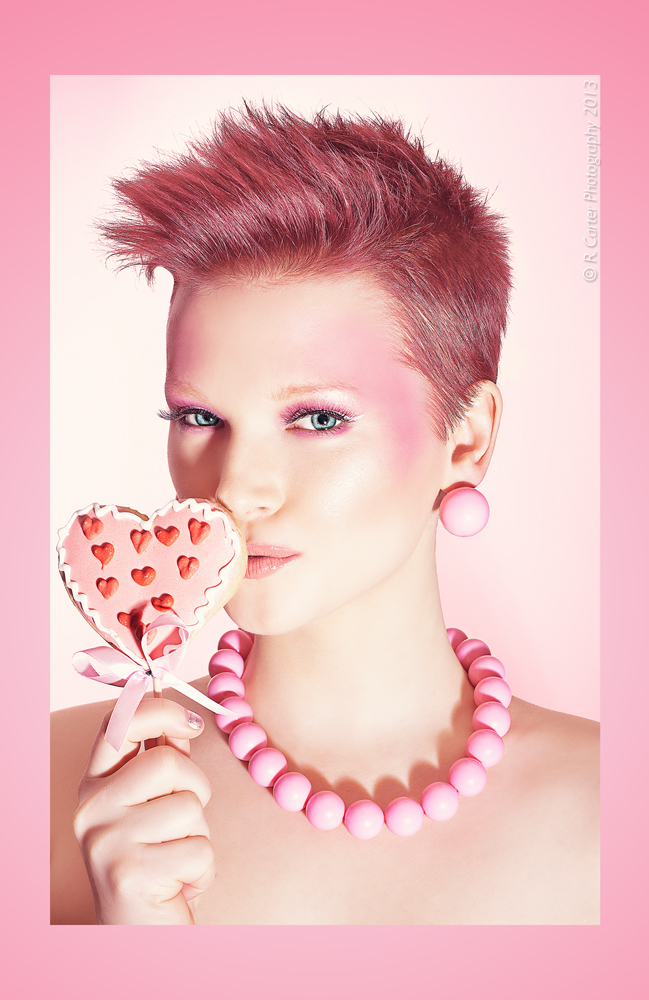
SWEET:For this look, I wanted lighting with a fun, playful pop. In this 2-light setup, the main light was a head with just a silver dome reflector, in the same position as before, just slightly lowered to create the graphic shadow cast by her necklace. I didn’t include any kind of diffusion on this light because the makeup, particularly the type of bronzer and highlight powder Raushanah used, is wonderfully luminescent, and I really wanted to it to shine. The key light was a head at half power molded using Cinefoil. If you’ve never experimented with that stuff, I highly recommend it! It’s extremely versatile as a light modifier, and can save you money if you’re just starting out and can’t afford separate modifiers like strip softboxes or grid spots. In case you’re wondering – and I know you are – yes, that cakepop was delicious.
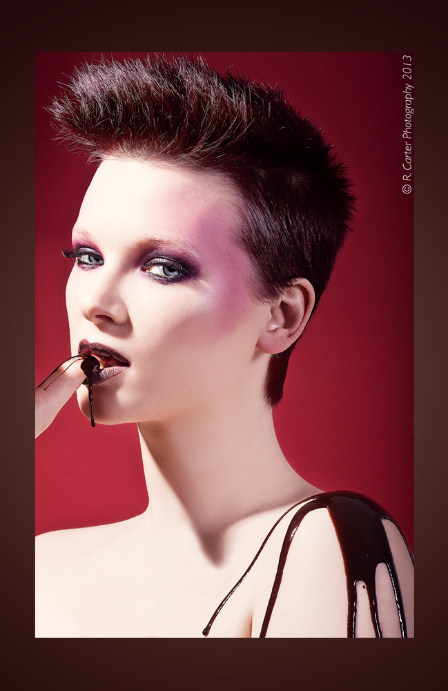
SEDUCTIVE:This look was a tough one due to a number of factors: a) I didn’t have any solid ideas of how I wanted to light it like I did for the other two, b) we were working with chocolate syrup, which, besides being incredibly aromatic and tempting, was incredibly messy and kind of a one-shot deal, and c) we were running very low on time, and had about 7 minutes to get the shot before our model had to skedaddle.Our main light here was in the same position as our key light from the Classic shot; high to camera left and pointing slightly behind the model so that it gradated onto the background. Instead of the Cinefoil to modify the light this time, I used a scrim from a softbox to diffuse the shadow transfer edge, and turned the power down about a stop. The fill light here was a head with just a silver dome reflector powered down to a little less than half. It was left in the same position as our main light in the second shot.
Tip: Something to keep in mind when using low-level lighting techniques is to be aware of odd shadows, they can really ruin a shot! Features that are usually easy to light overhead can become misshapen when the light comes from below, as you no doubt found out as a kid playing with flashlights. One of my favorite things about low-level lighting is the glow that it creates that just seems to exude life and energy.
Here are some other examples of low-level lighting I’ve done over the years:
The sheen in this image was created using a strip soft box.The strong, dramatic lighting in this shot was created using just a grid spot.This colorful split-level lighting was achieved using two grid spots; one very low, and one high.Another split-level lighting scenario. This one was achieved using a ring flash on a low stand as a main light, and a grid spot as an accent.
I hope this post was helpful, informative, or atleast entertaining! If you have any questions or comments, by all means don’t keep them to yourself! Share them down below in the comment section or email them to me directly at rcarterphoto@gmail.com.
Also, if there are any studiolightingsetups that you’d like to me to recreate, or any from my website that you’d like an explanation of, let me know! I’m up for the challenge and here to help!!
A photographer with an otherworldly eye, Bojana(pronounced bo-YA-na) Tatarska first caught my eye in the pages of Dansk Magazine with her editorial spread entitled Gilded. (Sidenote: Dansk is quickly becoming one of my favorite magazines because of it’s dynamic content and wonderfully large photo-friendly format. If you still haven’t checked it out in physical format, do yourself that favor.) Before I even get to her incredible body of work, let’s gather our bearings and set the record straight about Ms. Tatarska; this amazing woman is not only an accomplished photographer, but is also a drop-dead gorgeous fashion modeland has 2 Elle magazine covers under her belt (India and her homeland of Bulgaria, respectively). She is college-educated, having studied Art and Communication at the Universite Paris-Sorbonne, having noted that journalism was her first passion before photography. She’s also self-taught in the art of photography!! Bojana, I tip my hat to you!
Her work, in five words, is dazzling, sensual, feminine, fanciful, and incredibly sleek. (Okay, so that was 6 words…sue me.)
Bojana was born in Bulgaria, and is currently based in Paris. (Fun fact about Bulgaria: It’s the global leader in the production of essential oils, so when you’re pampering yourself with that lavender-scented body oil, give a little mental shout out to Bojana!!)
Visit Bojana Tatarska’s Online Portfolio and prepare to be swept away!
I first encountered fashion photographer Signe(prounounced SIG-nee)Vilstrup‘s work in the November issue of Dansk Magazine and was instantly stunned to the point of speechlessness for about ten minutes (here’s the spread that did me in titled Maternal Mirror). When I visited her online portfolio a few days later, my bout of speechlessness returned with a vengeance. The sheer breadth of it aside, every spread, every image, is teeming with a sort of magic that does not come around often..unless, apparently, you’re in Europe, in which case you’d be hard-pressed to find a fashion photographer who doesn’t have it (stay tuned for my next Amazing Artists update, about another European fashion photographer who is positively dripping with that same magic).
What captivated me initially about Signe’s work was her brilliant use of environment, and her story-telling capabilities. I have a real soft spot for fashion editorials that have narratives and characters, and she hit it. Hard. In a field permeated by images that sell, it was refreshing to find in her work images that were meant to tell. Her aesthetic is one that I greatly admire, and the consistently dynamic quality of her body of work is something I deeply aspire to achieve. In an adjective nutshell, Signe’s work is ethereal, cinematic, smart, romantic, and effortless.
According to her mini bio, Signe was born in 1977 and now resides in Copenhagen, Denmark, dividing her time between Paris and Milan.
Probably one of the more memorable shooting experiences I’ve had so far, this commissioned bridal lookbook for brilliant couture bridal designer Junko Yoshioka marked a lot of firsts for me: my first bridal shoot, first commissioned shoot in New York, first model casting (I met 2 ANTM alum!!), first time building a set, first experience with a Wacom tablet in post, and my very first lookbook! So, naturally, it was absolutely terrifying. Working with the stunning Alexandra Storm @ VNY Model Management made my job that much easier, although she kept getting lost in the forest…
Shooting layered, multi-textured, white-on-white gowns without losing detail proved to be pretty darn difficult, and required a lot of patience, trial-and-error, and a sizeable optometrist bill from the glare on the screen in post. For this ethereal fairytale lighting, I used a 3-light setupin the enchanted fairy forest against a wheat-colored seamless. The main light is a large beauty dish with a diffusion “sock” cover, set at a little over half power (I brought down the power in order to get as much detail in the gown as possible, and later boosted the exposure selectively in post). The beauty dish is set on a stand slightly above the model’s head about 4ft to the right of the her. The first accent light here is a strobe with a grid at half power and a periwinkle gel set about 5ft away to the left of the model. This accent light is helping to define the edges of the dress, and provided a lovely, delicate highlight across the model’s face and arm. I went with cooler colored gels because they tied in with our initial ideas of a wintery enchanted forest. The second accent light is another strobe with a grid, this time with a sky blue gel, set close to a quarter power. It is also set about 5ft away. The main purpose of this light was to provide a little fill, and to keep the cool color palette consistent. At first glance it’s hardly noticeable, especially with the surrounding forest of the same color, but as you’ll see from the “Before” image below, it gave the gown a soft glow around the edges, aiding in the airy quality of the finished product. And that’s all!! Really simple, right? About three hours (per image) in post and several spurts of hand cramps later, the enchanted forest became Alexandra’s new home.
In case you’re interested, here is the idea from conception to completion:
You’ll notice the fine attention to detail and shading, and my absolutely breathtaking draughtsmanship..just like my great great great grandfather, Henri Matisse taught me. ;-pOne of Junko’s reference images.One of my reference images, taken from M. Night Shayamalan’s The Village.All the images were shot using a fog machine, aiding in the ethereal quality of the light, and helping the model to better blend into the ‘misty’ forest.Voila! The final product!
I hope this post was helpful, informative, or atleast entertaining! If you have any questions or comments, by all means don’t keep them to yourself! Share them down below in the comment section or email them to me directly at rcarterphoto@gmail.com.
Also, if there are any studiolightingsetups that you’d like to me to recreate, or any from my website that you’d like an explanation of, let me know! I’m up for the challenge and here to help!!
This past week I had a last-minute opportunity to work with the stunning 6’1″ model Raelia Lewis! Sidenote: I will be billing her for my therapy expenses, as I developed an acute Napoleon complex once she put her heels on – but I digress. A Monday opening at the studio I shoot at presented itself on Saturday, which left me with a single day to come up with a theme and a team – just enough time for me to cross my fingers and see what I could come up with at a moment’s notice. Normally, I prefer to have atleast a week to develop an idea and pull all of the necessary elements together, but I have to say, flying by the seat of my pants was pretty exhilarating! In a single day I nabbed two awesome models (the drool-worthy Phil @ Colby Models NY being the second), acquired a great makeup artist (the consistently delightful Raushanah Washington), and brainstormed with stylist Lacora Emerson (who is as energetic as her rambunctious 8 year-old son)…phew! If there was ever a time I needed Hermoine’s Time Turner, this was it!
Inspired by textiles I found particularly interesting, I decided to do a beauty story centered around them, using some of my favorite commercial fashion images as a basis for each respective image.
VELVET: For this shot inspired by the wonderfully luxe velvet sofa, I needed lighting that was equally as sumptuous. I went with a classic2-light setup with the model about 1.5ft away from a metallic olive-colored wall. A gridded beauty dish set about 3ft above and slightly to the left of the model served as a main light, creating the gentle definition of her bone structure, and adding dimension to the textures of her jewelry. Because of the angle I was shooting at, the angle of her face, and the height of the light, there were initially no reflections of a light source in her eyes – an occurrence I refer to as “twinkling”. To add a twinkle and soften the shadows a bit, I added a fill light, a small grid set slightly lower than the model’s head about 6ft away to the right. The power on this one was turned way down, so as not to interfere too much with the direction of the main light. To help illuminate the texture in her jewelry a bit more, I moved in a 3-panel silver reflector directly under her face, angled towards her. The effects of this are most noticeable on the snakeskin and in the sliver of light in the bottom of her eyes.
CRYSTAL:For this shot inspired by the glamtastic crystal chair, I needed light that would really help the jewelry sparkle. I went with a timeless 2-light setup, using the same lights as the previous shot at different settings, with the model about 7ft away from a black seamless. As before the beauty dish was my main light, but this time I increased the height to about 5ft and boosted the power up to create longer, more defined shadows and specular highlights. This increase in height also affected the model’s facial features, as her cheekbones and eye cavities became more pronounced. The accent light was a grid, turned up to about half power about 2ft behind and to the right of the model. I decided to only highlight one side as opposed to both because I felt a complete rim light would throw off the balance of the frame in the left. Also, this way more attention is drawn to her bling!!
LEATHER:For this shot inspired by the sleek leather chair, I wanted a light that was just as chic, so I opted for a bit more modern approach, again using a simple 2-light setup with the model about 4ft away from a white seamless. The main light in this was our faithful beauty dish, set about 3ft above and slightly to the left of the model, exactly like the velvet shot. This time though, there was no second light to serve as fill light to soften the shadows. Instead, for the sake of the jewelry and to create a little more life in the eyes, I brought back in the 3-panel silver reflector directly under her face, angled towards her. The second light in this is a light with a dome reflector (no grid) with a red gel attached aimed directly at the white seamless. It is turned up to full power, which rendered the background yellow because of the light’s intensity. As the light traveled, the color of the gel took over, resulting in the red haze that washes over the model until it crosses paths with the main light. Admittedly, the yellow was a complete surprise, but I went with it. Gotta love experimenting and happy accidents!
I hope this post was helpful, informative, or atleast entertaining! If you have any questions or comments, by all means don’t keep them to yourself! Share them down below in the comment section or email them to me directly at rcarterphoto@gmail.com.
Also, if there are any studiolightingsetups that you’d like to me to recreate, or any from my website that you’d like an explanation of, let me know! I’m up for the challenge and here to help!!
Anyone who knows me will tell you that I am a very firm believer in the power of positive thinking and will-power. I believe that energies and auras are real, and karma really can be a you-know-what. My glass is usually half-full, and my grass is just as green as my neighbors’, thank you very much. That being said, everyone has off days, ruts, funks, or whatever else you want to call them, and I am no exception. September will make it a full year since I’ve graduated from college, and lately I can’t help but to reflect on all I’ve accomplished since then and all that I still have to do. It was during a long walk home one night, when my thoughts started turning negative and defeatist, that a thought occurred to me: when engaging in the processes of self-reflection and self-evaluation, your attitude and approach plays a major role on your outlook.
I like to think of life as a river – one that can be very dangerous if not navigated properly. On the one bank lies all of the reassuring elements in one’s life thus far: thriving relationships with friends and family, physical and mental health, past achievements (however grand or small in scale), and all of life’s little joys. Indeed, on this side of the river the sun is always shining, the birds are always chirping, and Disney princesses are practically falling from the trees (although considering it’s Disney, they’d probably descend gracefully with the help of butterflies and fairy dust). On the opposite bank though, things are not always so chipper.
On this bank lies elements of one’s life that seek to hinder one’s progress; things like doubt, past mistakes, lethargy, excuses, bad habits, and hesitation linger here like a thick fog. Speaking from experience, this fog of negativity can diminish your vision of the path ahead and discourage you from moving forward, making it easy to drift over to this side of the river and not even notice it.
The waters of the river that stretch ahead are full of possibilities and opportunities. It is important to remember that though they may be rough at times, these waters are not impossible to navigate with a bit of hard-work, a lot of determination, patience, and some positive thinking. And who knows – every now and then you may get a favorable current from the waters you’ve already traveled!
It can be very tempting to just rest on the bank of reassurance, and dangerously easy to crash onto the bank of hindrance – no one can blame you for doing either from time to time – but it is absolutely crucial to understand that in order to move forward, you can’t spend too much time on either side. You have to keep moving, to keep focus, and to keep hope in your heart that when you finally do reach the end of the river, the journey you took to get there will have been well worth it.
I hope you’ll keep these thoughts with you when you feel an episode of self-reflection coming on. Just remember that you have some place to go, and you won’t get there by standing still. 🙂
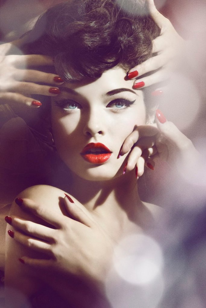
I won’t bore you with too many words on this post, mainly because these images speak volumes for themselves. Here is a collection of beauty images I’ve gathered from across the web that just screamed to be shared. I hope you find them as inspiring as I do!
(links to their respective online portfolios below:)
By photographer Lance Lee from Beijing by way of SingaporeBy photographer Lance Lee from Beijing by way of SingaporeBy photographer Igor Oussenko from RussiaBy photographer Igor Oussenko from RussiaBy photographer Mikhail Malyugin from RussiaBy photographer Mikhail Malyugin from RussiaBy photographer Diliana Florentin from BulgariaBy photographer Diliana Florentin from BulgariaBy photographer Johannes Stamcar from AustriaBy photographer Julio Cesar Gomez from Colombia
You can check out more of these brilliant photographers’ work at their websites: